
Color is not a feeling. It isn’t a mood, a memory, or a metaphor. It’s a physical event—a wavelength, a material condition. Yet when we write about it, we so often reach for the poetic shortcut: the “warm” ochre, the “melancholy” blue, the “angry” red. These aren’t descriptions; they’re evasions. They tell us nothing about the color itself, only about the writer’s emotional reflexes. To write about color with precision is to resist the lazy drift into symbolism and to anchor language in the observable world. It is a political act, because it refuses to let aesthetics float free of material reality.
This is not a call for cold, clinical prose. It’s a demand for a different kind of attention. When we describe a color as it exists—its hue, its saturation, its value, its surface, its interaction with light—we are not stripping it of meaning. We are building meaning from the ground up, from the physical facts that make perception possible. The challenge is to make those facts legible, even urgent, without resorting to the worn-out vocabulary of emotion.

The Problem with Metaphor
Metaphor is not inherently wrong. It’s a fundamental structure of thought, a way of understanding one thing in terms of another. But when it comes to color, metaphor often becomes a substitute for observation. We say a red is “passionate” because we have been trained to associate red with passion, not because we have looked at that specific red and seen something that genuinely corresponds to passion. The metaphor is pre-packaged, inherited, unearned. It short-circuits the act of seeing.
This matters because color is not a universal language. The associations we attach to colors are culturally specific, historically contingent, and often deeply ideological. When a Western writer describes a “pure” white, they are drawing on a long tradition that equates whiteness with innocence, cleanliness, and moral superiority—a tradition that has real, material consequences for how bodies are perceived and treated. To write about color without metaphor is to refuse to reproduce those hidden ideologies automatically. It is to make the color present as a physical fact, not as a cultural symbol.
The Vocabulary of Precision
To write about color without metaphor, you need a working vocabulary of color’s physical dimensions. This does not mean you must become a scientist. It means you must learn to see and name what is actually there.
Hue is the quality that distinguishes red from blue from yellow. It is the spectral identity of the color, the wavelength range. But hue alone is almost never enough. A red can be crimson, scarlet, vermilion, or carmine—each a different hue, each with its own material history. Crimson was originally a dye made from kermes insects; vermilion came from cinnabar. These names carry the trace of their origins, and using them precisely is a way of honoring the physical substance of color.
Saturation is the intensity or purity of a color. A highly saturated color is vivid, concentrated; a desaturated color is muted, grayish. Saturation is not a mood—it is a measurable quality. Describing a blue as “highly saturated” tells you something about how that blue behaves in the eye, how it competes with surrounding colors, how it reflects or absorbs light. It is a fact, not a feeling.
Value is lightness or darkness. It is the dimension that allows us to see form and depth. A yellow can be pale, almost white, or deep, approaching brown. Value is relational; it depends on context, on the colors that surround it. To describe a color’s value is to describe its position in a field of light, not its emotional temperature.
These three dimensions—hue, saturation, value—are the basic grammar of color. But they are only the beginning. Color also has temperature, not in the metaphorical sense of “warm” or “cool” feelings, but in the physical sense of correlated color temperature, measured in Kelvin. A blue can be a 10,000 K sky blue or a 2,700 K candlelight blue. The difference is not poetic; it is spectral. And color has surface: matte, glossy, textured, translucent. A red on velvet is not the same color as a red on polished metal, even if the hue, saturation, and value are identical. The surface scatters or concentrates the light, changing what reaches the eye.
Writing the Physical Color
How do we put this into practice? Consider a simple object: a painted wall. The metaphorical writer might call it “a soothing blue.” The precise writer looks at the wall and notes: the blue is a low-saturation cerulean, value around 7 on the Munsell scale, applied in a matte finish that scatters the overhead fluorescent light into a soft, directionless haze. The color is not soothing; the light is diffuse, the saturation is low, the value is medium-high. These physical conditions create a visual effect that we might interpret as calm, but the interpretation comes after the description, not in place of it.
This approach demands more words, more sentences. It slows the reader down, forces them to reconstruct the color in their mind from its material properties. That slowness is a form of respect—for the color, for the reader, for the act of perception itself. It says: this color is not a stand-in for your emotions. It is a real thing in the world, and it deserves to be seen as it is.
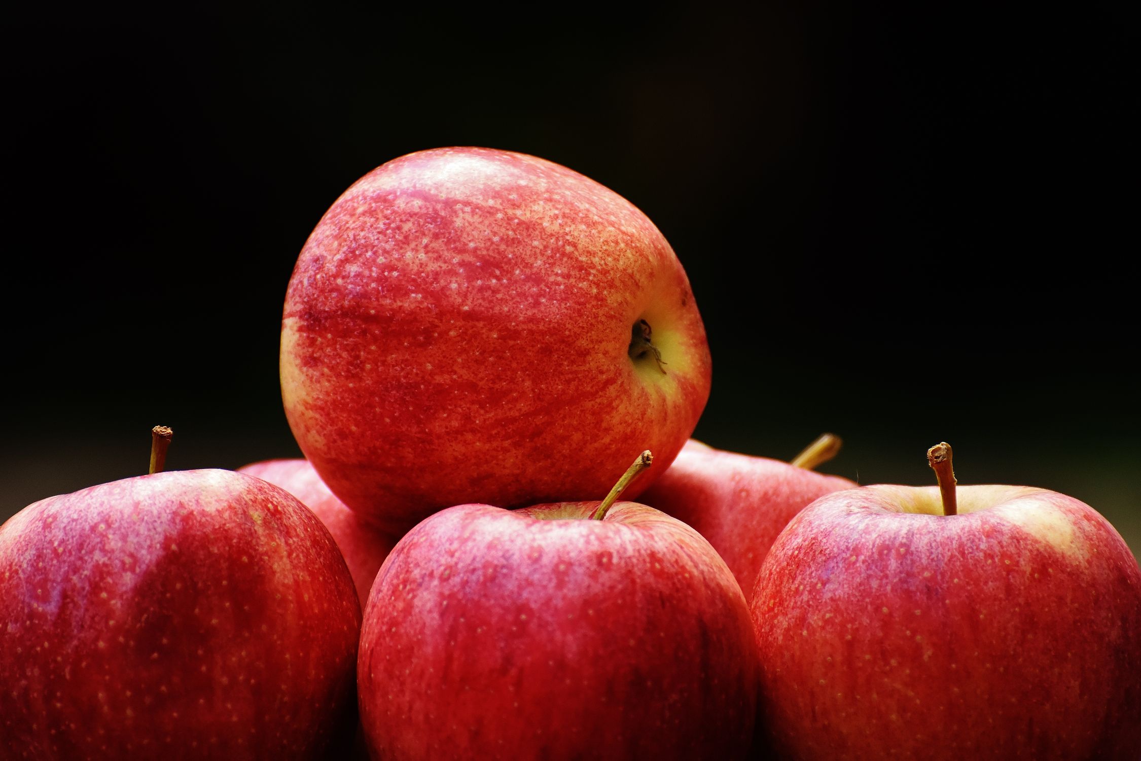
Take another example: the skin of a fruit. A lemon is not “cheerful yellow.” A lemon, under noon sunlight, is a highly saturated yellow with a slight greenish shift in hue, value around 8, surface waxy and micro-textured, reflecting a sharp specular highlight. That description does not tell you how to feel about the lemon. It gives you the lemon as a visual fact, and trusts you to build your own response.
Color as Material History
Every color has a biography. Pigments and dyes come from somewhere: earth, insects, plants, chemical synthesis. To name a color by its material origin is to anchor it in labor, trade, and ecology. Ultramarine was once made from lapis lazuli mined in Afghanistan, transported along the Silk Road, ground and purified in European workshops. Its cost was enormous, its use often restricted to the robes of the Virgin Mary. When you write “ultramarine” instead of “deep blue,” you invoke that history. You remind the reader that color is not abstract—it is extracted, processed, bought, and sold.
This is not metaphor. It is material specificity. The same applies to colors derived from synthetic chemistry. The first aniline dye, mauveine, was discovered accidentally in 1856 by William Henry Perkin while he was trying to synthesize quinine. The color that flooded Victorian fashion was a byproduct of industrial chemistry, a sign of the new age of coal-tar derivatives. To call a color “mauve” is to name that history, to connect a hue to the factories and laboratories that produced it.
Writing about color in this way refuses the myth of color as pure, transcendent sensation. It insists that color is always embedded in systems of production, circulation, and consumption. Even the colors on our screens are material: they are emissions of phosphors or LEDs, calibrated to sRGB or DCI-P3 color spaces, dependent on rare-earth minerals mined under specific labor conditions. To ignore this is to aestheticize color, to pretend it floats free of the world. That pretense is political.
Color and the Body
Color is not just out there in the world. It happens inside the body, in the retina and the visual cortex. The photoreceptors—rods and cones—transduce electromagnetic radiation into neural signals. Cones come in three types, sensitive to short, medium, and long wavelengths, roughly corresponding to blue, green, and red. But this is not a simple mapping. Color perception is contextual, comparative, and constructed. The same wavelength can appear as different colors depending on surrounding colors, adaptation state, and even linguistic categories.
To write about color with precision is to acknowledge this embodied, perceptual process. It means describing not just the color “out there” but the conditions under which it is seen. The time of day, the quality of light, the angle of view, the fatigue of the eye. A color seen at dusk is not the same color seen at noon, not because the object has changed but because the light has changed, and with it the spectral distribution reaching the retina. This is not metaphor; it is optics.
Consider the phenomenon of afterimages. Stare at a red square, then look at a white wall. You will see a cyan square. This is not a trick of the mind; it is the fatigue of the long-wavelength cones, causing the opponent system to signal the complementary hue. To write about that cyan afterimage as “ghostly” or “spectral” is to miss the point. It is a physiological event, a trace of the body’s own machinery. The precise writer describes the cyan as a low-saturation, blue-green hue, value around 6, appearing to float because it moves with the eye’s saccades, not because it is ethereal.
Color in Context: The Relational Field
No color exists alone. Every color is modified by the colors adjacent to it. This is the principle of simultaneous contrast: a gray square on a red background will appear greenish; the same gray on a green background will appear reddish. The effect is not an illusion; it is a real shift in perceived hue caused by lateral inhibition in the retina. To describe a color accurately, you must describe its context.
This is where precise color writing becomes almost architectural. You are not just naming a color; you are mapping a field of relationships. A painting is not a collection of discrete colors; it is a system of mutual influences. A room is not painted a single color; it is a space where colors interact with each other and with the light. To write about a “white” gallery wall is to write about a surface that reflects the colors of the artworks, the clothing of the visitors, the temperature of the lighting. The wall is never simply white.
This relational thinking extends to the social world. Colors are never just colors; they are colors in context, and context includes the human bodies that wear them, the spaces they occupy, the histories they carry. A red dress is not the same red on every body. The same red, with the same spectral reflectance, will look different against different skin tones because of simultaneous contrast. To write about that red without acknowledging the body beneath it is to write about an abstraction, not a person.
The Politics of Precision
Why does this matter? Because imprecise color language is not just sloppy; it is often a tool of erasure. When a fashion critic describes a garment as “nude,” they are making a claim about what skin color is normal, default, unmarked. That claim is false and exclusionary. A precise writer would specify: a beige with low saturation, value around 7, pinkish undertone, matching a narrow range of light skin tones. That description reveals the ideology hidden in the word “nude.” It shows that the color is not universal; it is specific, and its specificity excludes.
The same applies to racialized color terms. “Flesh-colored” is not a neutral descriptor. It assumes a particular flesh as the standard. To write about color precisely is to refuse that assumption. It is to describe the actual hue, value, and saturation of a color, and to name its material composition if relevant. This is not political correctness; it is accuracy. The politics lie in the refusal to let language naturalize what is, in fact, constructed.
Even in landscape writing, precision has political weight. To describe a field as “green” is to say almost nothing. To describe it as the yellow-green of ripening wheat, value 6, saturation medium, under a sky of 6500 K daylight, is to locate that field in a specific agricultural cycle, a specific climate, a specific economy. It is to acknowledge that the color of the field is the result of human decisions about what to plant, when to harvest, how to manage the land. The color is not just scenery; it is evidence.

Practical Exercises for the Writer
How do you train yourself to write this way? Start by removing metaphor from your descriptive vocabulary for a week. When you see a color, do not allow yourself to name an emotion. Instead, ask: what is the hue? Can I name it more specifically—not just blue, but cobalt, cerulean, Prussian? What is the saturation? Is it intense or grayed? What is the value? Is it light, dark, middle? What is the surface? What is the light source? What are the adjacent colors?
Keep a color journal. Each day, describe one color you encounter in full physical detail. Do not mention your feelings. Do not mention what the color reminds you of. Just the color, as a material fact. After a week, read back through your entries. You will likely find that they are not cold or lifeless. They are vivid in a different way—vivid because they are specific, because they demand that you pay attention.
Next, research the colors you use. If you find yourself reaching for “ochre,” look up what ochre actually is: a natural earth pigment containing iron oxide, ranging from yellow to brown to red, used since prehistoric times. That knowledge will inflect your description. It will give the color weight, history, substance. You do not need to include all that information in your sentence, but it should be present in your mind as you write.
Finally, practice writing color in relation. Describe a scene not as a list of colored objects but as a field of interacting colors. How does the red of the tablecloth shift the perceived hue of the bread on the plate? How does the green of the tree outside the window alter the color of the wall beside it? This is the hardest skill, because it requires holding multiple colors in mind at once and tracking their mutual effects. But it is also the most rewarding, because it produces descriptions that feel true to the complexity of actual seeing.
When Metaphor Returns—On Your Terms
The goal is not to banish metaphor forever. It is to earn the right to use it. After you have described a color with precision, after you have established its physical reality, you may choose to reach for a metaphor. But that metaphor will now be grounded. It will not be a shortcut; it will be a leap, and the reader will feel the ground you leaped from.
If you have described a red as a highly saturated cadmium red, value 4, glossy finish, reflecting a pinpoint highlight from a 3200 K tungsten lamp, and then you write that it “pulses like a warning,” the simile has force because it is tethered to specifics. The high saturation, the low value, the glossy highlight—these physical properties justify the comparison to a warning signal. The metaphor is not replacing observation; it is extending it.
This is the difference between lazy color writing and disciplined color writing. The lazy writer starts with the metaphor and never reaches the color. The disciplined writer starts with the color and may, sometimes, earn the metaphor. The difference is not just aesthetic. It is ethical. It is about whether we treat the visible world as a screen for our projections or as a reality that demands our attention.
Color and the Limits of Language
There is a final honesty required. Language cannot fully capture color. The best description is still a description, not the color itself. This is not a failure; it is a condition of writing. The precise writer acknowledges this gap. They do not pretend to reproduce the color in the reader’s mind. They provide the coordinates from which the reader can construct their own approximation, their own memory-tinged version.
This acknowledgment is itself a kind of precision. It says: here are the facts I can give you—the hue, the saturation, the value, the surface, the light, the context. The rest is your own seeing, your own body, your own history. I will not colonize your perception with my emotions. I will give you the materials and trust you to build.
In a culture that constantly tells us what to feel, that packages emotions and sells them back to us as aesthetics, this trust is radical. To write about color without metaphor is to refuse to do the reader’s feeling for them. It is to insist that feeling must arise from encounter, not from instruction. It is to treat the reader as a fellow perceiver, not as a consumer of pre-digested sentiment.
FAQ
Is it ever acceptable to use emotional language for color?
Yes, but only after you have established the physical specifics. Emotional language becomes acceptable when it is earned through precise observation, not when it substitutes for observation. The key is sequence: describe first, interpret second. The reader should be able to see the color before they are told how to feel about it.
How do I describe color accurately if I don’t know the technical terms?
You do not need a degree in color science. Start with basic distinctions: hue (what color is it, as specifically as you can name it), saturation (how intense or grayed is it), value (how light or dark is it). Use ordinary language to describe surface (matte, shiny, rough) and light (bright, dim, directional, diffuse). The goal is attention, not jargon. Over time, you can learn more precise vocabulary, but the habit of looking closely is what matters most.
Doesn’t this approach make writing cold and technical?
It can, if done without care. But precision is not inherently cold. A detailed description of a color’s physical properties can be deeply evocative because it invites the reader to construct the experience themselves. The warmth comes from the act of shared attention, not from emotional adjectives. Many readers find precise description more immersive than metaphorical shorthand because it respects their own perceptual capacities.
How does this apply to digital colors on screens?
Digital colors are still material. They are produced by light-emitting diodes or liquid crystal filters, calibrated to specific color spaces, viewed under specific ambient conditions. To describe a digital color precisely, you might note its RGB or hex values as a reference, but more importantly, describe how it appears on the screen: the glow, the pixel structure if visible, the way it changes with viewing angle. The screen is a physical object, and the color it displays is a physical event.